Blank Canvas
Last year we were asked to visit a new-build house on a small development in a village in Dorset. The new owners had moved from a petit, traditional ham stone cottage to an open-plan, airy new-build and were at a loss as to how to tackle the interior to make it feel like home. In their previous home they had felt comfortable making decisions and had tackled the design and DIY themselves. Being faced with a large grey space they couldn’t work out how to make it gel with their existing furniture and belongings. The owners wanted us to focus on the master bedroom and living/dining area to make it feel more like home.
The Problems
On our first meeting it became clear they loved the light and open-plan design on their new home but missed colour. They didn’t know how to zone the ground floor to make it work for them and their belongings. The furniture they had bought with them fitted well into a cottage but we noticed the sitting room felt like a corridor. Their sofa, armchair and coffee table felt oversized and awkward in the new space. The 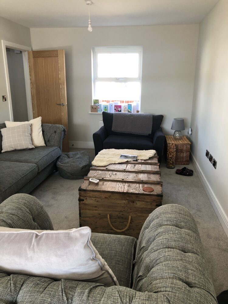 owners had followed the example layout of the Show home, which if you’ve never noticed always features smaller furniture and tends to have more contemporary feel. A quick layout change after we left, and the owners already felt a dramatic difference which they messaged us about; they couldn’t believe such a simple change would have such an impact.
The Brief
As a result of our meeting we devised a project brief introducing colour in the dining area and master bedroom. Exploring the layout of the ground floor, creating a social feel in the living area that did not focus on the TV and disguised the long, thin dimensions of the room. Using existing key pieces of furniture and finding extra pieces that would mix in; finding effective storage for the difficult eaves wardrobe and include artwork, accessories and objects that reflected the owner’s quirky sense of humour.
The Process
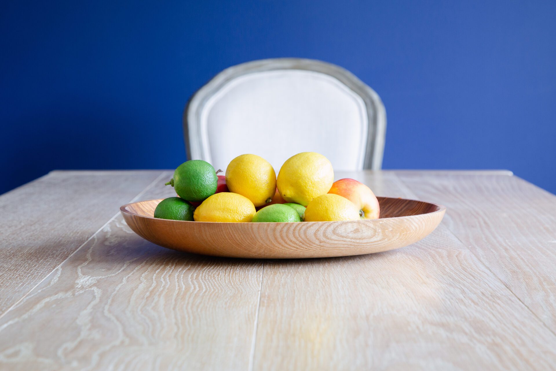
We loved their dining table, a beautiful pale wood piece that was handmade in Bridport, but it was lost against the grey walls and was crying out for a bold colour behind it. We needed the colour to be deep and rich but traditional, so we opted for a gorgeous blue on the wall where the southern sunlight from the garden hits. It changes considerably depending on the weather and time of the day, we paired it with Strong White by Farrow & Ball. Although the String White was not hugely different from the original wall colour, it’s more 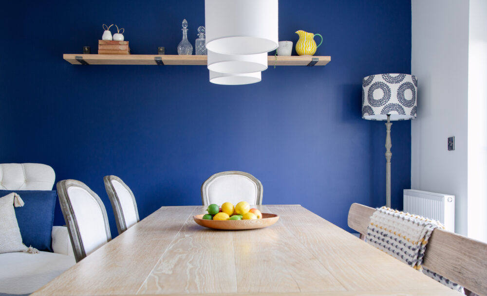 subtle and a little more contemporary. Adding pendent lighting, a floor lamp and shelving on the blue wall broke up the space further and made it feel more considered. With the open plan nature of the room, we followed with the blue tones into the living area. Adding cushions, throws, lampshades, a striped armchair and formal pouffe coffee table to make the space cosy and sociable. Adding in a range of neutral tones and a hint of mustard yellow gave the area its own distinct feel without fighting the dining area. We recommended a Samsung Art TV that could be wall hung and surrounded it by prints and artwork, the beauty of this is it appears as a painting rather than a tv. The owners were keen for something a little different for the other walls, so we looked at creating a textile hanging which provides storage for their throws. This can easily be changed as they alter their throws and also softens the space and adds a sense of height. Finally adding in houseplants and some of the owners beloved books and accessories personalised the ground floor even more.
The Master Bedroom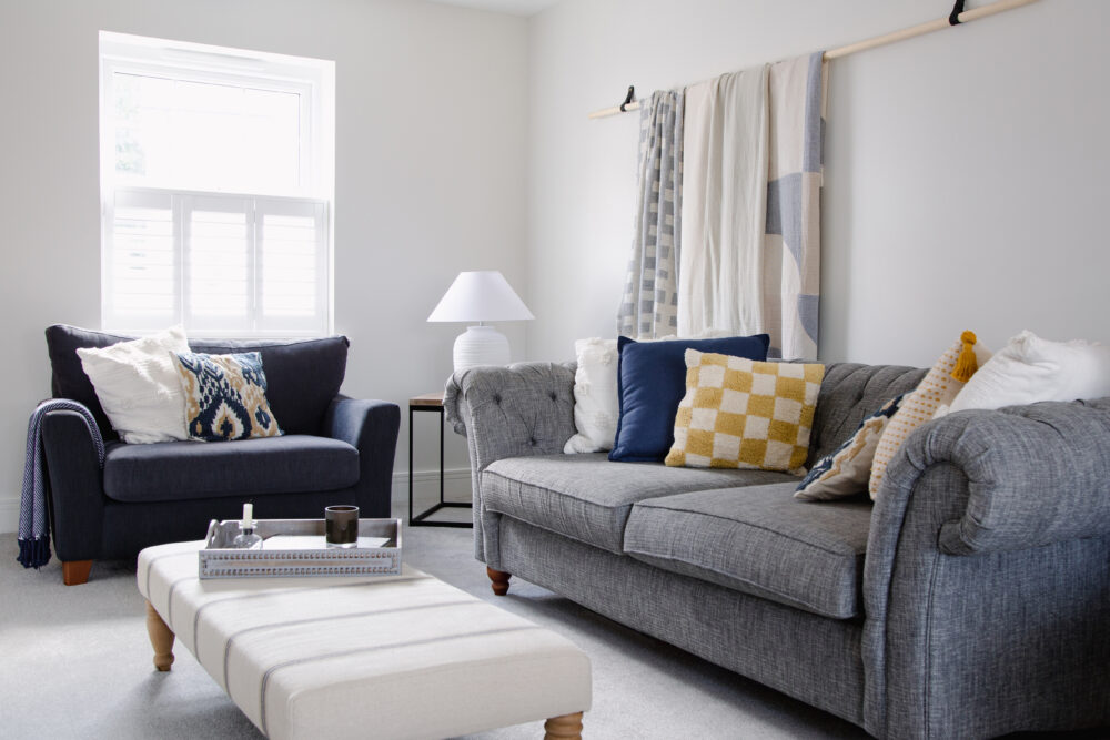
The brief for the master bedroom was to have a luxury feel; bring the countryside surrounding the house in and replace the tired bedroom furniture. Green immediately jumped to mind but not a fresh or bright tone as the bedroom is at the top of the house with windows on both sides so gets a lot of natural light. We opted for Obsidian Green by Little Greene, an almost black green. The original plan had been to take the colour all the way round the lower half of the room, utilising the natural line created by the eaves ceiling, and pair it with a fresh mid blue and Loft White, again Little Greene. As always designs evolve and by the end the green became a feature wall behind the oversized white bedhead. Adding in generously sized limewash effect bedside tables and subtly texture lamps balanced the bedhead and gave a nod to the natural elements that had given us inspiration. The owners spotted a quirky astronaut pillowcase on a trip to a local shop, The Circus,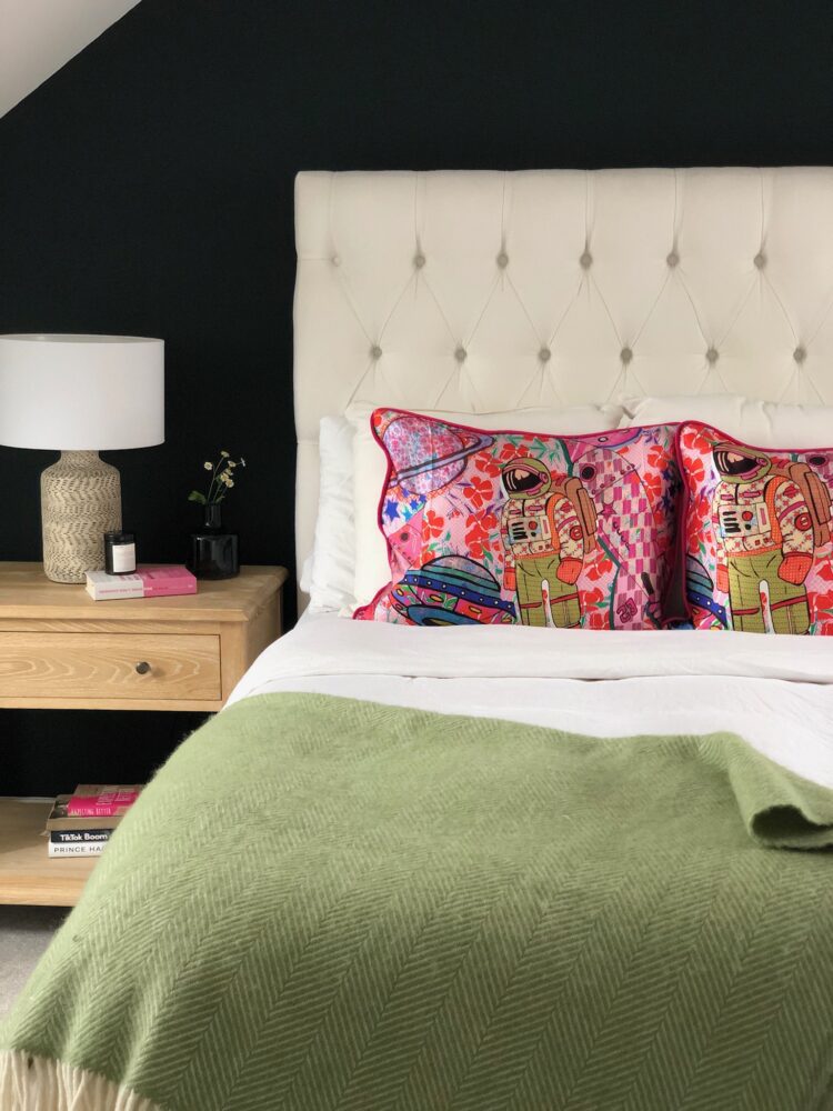 in Sherborne and fell in love. We had it made into two cushions backed with a deep pink velvet and so the third colour for the room pivoted to pink. There are little nods in other accessories around the room as well as other natural materials such as a coy rope stool and wool blankets.
New Home
We had such fun working on this project. We loved finding ways to balance the needs to functionality, the desire to have some character and working with clients who were really invested in the process. Seeing them really enjoy the project and found their confidence again has been a lovely journey to go through, and they have realised their intentions of making a new house into their new home.
